Showing posts with label Art. Show all posts

Wednesday, July 27, 2022

Mrs Box by Dora Carrington

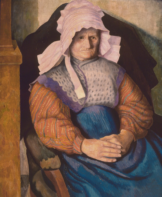
Dora Carrington (1893-1932), Mrs Box, 1919 © Trustees of the Cecil Higgins Art Gallery

I have written about this painting many times. It is one of my favourites in the Cecil Higgins Art Gallery Collection. It is Dora Carrington at her finest, projecting her own feelings onto the portrait of the Cornish farmer, Mrs Box.

Carrington first met Mrs Box in 1917. She was on holiday in Cornwall with Lytton Strachey and friends. After finding their initial accommodation a real ‘pigsty of a farm’ and enduring multiple flea bites, they contacted neighbouring farms to find somewhere else to stay. Mrs Box at Home Farm, Welcombe responded and the party moved to her ‘simply perfect’ farm. 

Carrington writes to her friend Barbara ‘I am so happy here. Almost a headache every morning because I get so tired and exhausted. Simply loving so hard! The sea has yellow sands and big rocks and there are valleys such as you never saw with rivulets which flow down to the sea and green forests on the hills. It is surely one of the best places in England. I am painting old Mere Box who is 70, an amazing old Lady, who wears a pink bonnet and curious garments. Miss Box and her sister and brother keep the farm. I have swum in the sea twice with Noel.’

Carrington was to return to Mrs Box again over the years. In 1919 she took her future husband Ralph whom Mrs Box ‘thought was the most lovely young man’.

I have always written about the painting and Mrs Box from Carrington’s perspective, always using Carrington’s explanation of who she was. As part of the research into the Body & Soul exhibition, in which the painting is currently on display, I started to look into who Mrs Box was. Professor Christiana Payne and Dr Mary O’Neill, who are co-curators of the exhibition, set me off on the task of finding out about her. I went to my usual source for all things ancestry, Higgins volunteer Melissa, who swiftly gave me all the information she could on Mrs Box, including her name, Elizabeth. 

Elizabeth was born in 1847, most likely in the Bideford workhouse to Elizabeth Colwill and Thomas Box, who were married a few years later. She spent most, if not all, of her childhood living with her maternal grandparents, Richard (a thatcher) and Betty in Down, Welcombe. When she was 18, she had her first child, Mary Grace; two years later she had another daughter, Elizabeth Ann. Throughout this time Elizabeth remained unmarried and the girls were given their great grandparents surname, Colwill. She moved to several homes around Welcombe over the years, her grandmother died and her grandfather retired, but remained living with Elizabeth wherever she moved. She had several jobs: charwoman, housekeeper and church caretaker. When she was 36, she had another daughter, Emma Jane followed by a son William, both children were given her name, Box. When Carrington knew her, she was living at Mead Farm with her farmer son and her eldest daughter. Home Farm, where Carrington and her friends stayed, was next door and must have been let out by the Box family.

All this information found by Melissa gave us much more insight into the woman we knew as Mrs Box, but also left us puzzled as to who the children’s father was, and why they were given Elizabeth’s surname. Ancestry could give us nothing, there is no marriage record for Elizabeth and each of the children have no known father. The youngest child, Elizabeth’s only son William, gave us a clue. His name was William Richard Oke Box, a name that couldn’t have been too common in the 1890s and might help us to find out more; and indeed it did. 

William can be found in three articles from 1895, in Devon newspapers reporting on a paternity case brought by Elizabeth Box of Welcombe for her two children; ten-year-old Richard and 13-year-old Emma Jane. The defendant is Titus Oke who owned a cottage on his family’s farm that Elizabeth had briefly lived in. A witness testified that Titus visited Elizabeth ‘frequently’ and continued to do so after the birth of both their children. Titus had regularly given Elizabeth money to help care for both children as well as ‘a suit of clothes and rabbits’ but when he got married the payments stopped, leading to Elizabeth taking him to court. The judge ruled in her favour and ordered Titus to pay 2s a week for each child until they were sixteen. One of the articles gave us a bit more information about Elizabeth’s life, her two older children are also mentioned, not by name but by arrangements with their fathers. It seems that Elizabeth accepted a settlement of £20 from the father of her eldest child, Mary Grace, born when she was 18. Before she could do the same with the father of her daughter, Elizabeth Ann, born two years later ‘the father went away’.

From all of this, it is impossible to know what Elizabeth Box was like but what I find particularly heartening is that she kept all four of her children with her and remained living with her grandparents until their deaths. So many stories from history of illegitimate children end with shame and sadness for the women involved, but not so for ‘Mrs’ Box, whom Carrington describes as ‘an amazing old lady’ who ‘is still full of vigour’ and whom on Carrington’s last visit to the farm ‘appeared driving the cows; she held up both her arms and waved them, with a stick in one hand and then ran towards me!’. When I told Christiana what I had found out, she wondered if Carrington had asked Mrs Box to tell her about her life as she painted her. Maybe that is why she paints her so beautifully, two women from very different backgrounds, but both finding common ground with their unconventional lives.

You can see Mrs Box by Dora Carrington's on display in the Body & Soul exhibition.

Written by Victoria Partridge, Keeper of Fine and Decorative Art

Sunday, October 31, 2021

Five Higgins Horrors for Halloween

To celebrate Halloween, we have put together five Higgins Horrors for you to enjoy on the creepiest day of the year. Find out more about the spooktacular objects and artworks in our collections, if you dare…

Do You Want to Play?


Bobalicon by Francisco Goya c.1818-19

'Bobalicon' (Simpleton) is part of Francisco Goya’s last series of prints ‘Los Disparates’ (The Follies) that were published 30 years after his death. Though the meaning of this print is unclear, it was made during a time of political and social upheaval in 19th century Spain. In this nightmarish scene, Goya shows the grotesque side of carnivals with a giant dancing castanet-player, transformed into a disturbing figure and surrounded by ghostly faces. His audience consists of a man hiding behind his female companion who is scared rigid by the sight.

Spellbound


Witch Bottle

This witch bottle dates back to the 17th century and was found buried at Renhold. Witch Bottles were used as counter-magical devices for protection. Folk healers would mix together a variety of ingredients inside, including rosemary, red wine, seawater, thorns, sand, oil, hair, nail clippings and urine. The witch bottle would then be buried or hidden away where no one could find it. For the spell to work fully, the bottle had to remain hidden and unbroken. You can see this Witch Bottle on display in the Collectors Gallery.

Medieval Monsters


13th Century Corbel

This carved stone corbel was once part of Bedford’s St. Paul's Church during the 13th century. Medieval corbels were often decorated with angels placed high on the walls overlooking the congregation. However some churches depicted demons, gargoyles and grotesque figures as a reminder of ever-present evil. It was also thought that these terrifying corbels could serve as protection against harm and defend those within the church by fighting the Devil with his own. You can see this medieval corbel on display in the Settlement Gallery.

Very Superstitious


The Desiccated Cat

In the 17th century cats were regarded as being particularly gifted with a sixth sense and having a connection with the afterlife. It was believed that they could protect the home and guard against evil spirits, witches’ spells and curses in relation to the common superstitions of the time. They were intentionally hidden in walls, floors or attics, sometimes with the cat’s innards removed, dried and stuffed with straw. They were often placed into hunting positions to help protect the family home.

Double Double Toil and Trouble


Macbeth and the Witches by Richard Westall c.1797

This drawing is based on the three weird sisters from William Shakespeare's play, 'Macbeth'. It is set during Act One, Scene Three in the middle of a thunderstorm, upon a ‘blasted heath’. Here the witches share their wicked deeds, voice their incantations and predict Macbeth's future before vanishing into the air. Westall follows the description of the scene closely as the thundering sky and grotesque appearance of the witches give a sense of foreboding and doom.

‘So withered and so wild in their attire,
That look not like the inhabitants o' the earth,
And yet are on't?’

Written by Rebekah Matus, Audience Development Officer


Friday, June 18, 2021

The Turbulent Life of Marco Ricci

Marco Ricci (1676-1730), Apollo and the Musesc.1710 © Trustees of the Cecil Higgins Art Gallery (The Higgins Bedford)

While most of the artworks in the Under the Same Sky exhibition are by Britain’s finest landscape artists, Marco Ricci’s Apollo and the Muses offers a taste of Italian Baroque splendour. For all of its serene heavenliness, the dramatically dark life of the artist could inspire the most brutal Caravaggio scene.

Ricci was born in Belluno, Italy, in 1676. His uncle, Sebastiano (1659-1734), was an eminent painter and trained a young Marco in his workshop. Despite receiving acclaim in Venice, Marco had to flee in his twenties after killing a gondolier in a brawl.
 
During his time on the run, he refined his techniques in Dalmatia (part of modern-day Croatia), the Netherlands, Florence and Rome. In the latter, he became a prolific maker of capricci etchings of ancient ruins, and vedute ‘views’ of cities, both of which were popularised by his famous contemporary Canaletto (1697-1768).
 
In 1708, Ricci began his two-year stay in England. Generally unexposed to the Italian Baroque style, English patrons admired his work. This popularity secured him a good living painting scenery for the Queen’s Theatre in Haymarket, London.
 
His talents also attracted many private patrons who commissioned him to decorate their homes Apollo and the Muses is an example of a ceiling design he may have done for a client. Its loose, light brushstrokes show his adoption of the styles from all the places he visited, resulting in a talent of quickly producing vivid yet ethereal scenes.
 
In 1730, he is said to have taken his own life dressed in a bizarre costume with a sword so that he could die ‘like a cavaliere.’
 
Despite achieving great recognition and patronage during his lifetime, art history has largely neglected Marco Ricci, preferring instead to celebrate his uncle. However, he has been described by contemporary critics as ‘one the most versatile eighteenth-century Italian artists’.
 
See Apollo and the Muses by Marco Ricci in the Under the Same Sky exhibition, on until Sunday 27 June. Safety measures are in place and you will need to book a FREE timed entry ticket to visit.

Written by Tom MacKinnon, Curatorial Volunteer 

Bibliography:
http://www.getty.edu/art/collection/artists/434/marco-ricci-italian-1676-1730/
 
Marco Ricci. (2000). A Capriccio with Horses Watering in a River outside a Walled Town, c. 1720. Art Institute of Chicago Museum Studies, 26(1), 28-93. doi:10.2307/4104416
 
Leppert, R. (1986). Imagery, Musical Confrontation and Cultural Difference in Early 18th-Century London. Early Music, 14(3), 323-345. Retrieved February 9, 2021, from http://www.jstor.org/stable/3127106

Friday, May 14, 2021

David Cox: The Mill (1853)

When The Higgins Bedford reopens on Tuesday 18th May, visitors will once again be able to enjoy our current weather exhibition, Under the Same Sky, featuring works by the finest landscape artists in British art history. One of these artists is David Cox (1783-1859), whose pioneering blend of Romanticism and Impressionism results in such charming watercolour scenes as The Mill (1853).

Born in Birmingham in 1783 to a blacksmith father, he was considered too weak for manual work, and so helped out by decorating its products. After a childhood of artisanal painting and some formal drawing education, he moved to London aged 20 to work as a scene painter but gave up after very little success. 

David Cox, The Mill, 1853 © Trustees of the Cecil Higgins Art Gallery (The Higgins Bedford)

A 24-year-old Cox then decided to spend the rest of his working life as a teacher, and was extremely popular as one. He published his Treatise on Landscape Painting and Effect in Water Colours in 1813 due to high demand, and was often praised for his kind, honest character and willingness to help beyond his professional obligation. Meanwhile, he tried to establish himself as an eminent artist by exhibiting his work at the Society of Watercolour Artists. However, he was hindered by his dogged belief in his unconventional style; despite a close social circle that supported him throughout his career, he sold very few paintings. 

Most of his rivals painted in a style that appealed to a public who, according to biographer N. Neal Solly, ‘frequently disliked what was not smooth and highly finished’. Cox, however, despised ‘mere portraits of places’. He championed emotional effect over faithfulness to real-life, as is evident in The Mill.  According to the Dictionary of National Biography, he used ‘few colours and a full brush, disregarding small details in order to greater breadth and brilliancy of effect’. The soft, dream-like qualities can be attributed to his tendency to paint from memory. He disliked directly copying from nature or other artworks, advising in his Treatise that ‘the picture should be complete and perfect in the mind before it is even traced upon the canvas’. 

Cox felt that his best works were painted on a cheap wrapping paper known as Scotch paper. Its roughness allows it to absorb more colour than most surfaces, but leaves little black specks. When asked how he tackled this problem, Cox said ‘Oh, I just put wings on them, and then they fly away as birds’.  

Despite his lack of recognition among his contemporaries, history remembers David Cox favourably. Many consider his style, with its short brush strokes and loose forms, a precursor to the famous Impressionism movement. 

It is no coincidence that his works were fetching enormous sums at auction in the 1870s, a decade that saw the rise of Impressionists such as Claude Monet. From then on, Cox has been considered one of British art’s greatest figures, described by biographer William Hall as ‘second only to Turner… and in some respects, not even second to him.’

See The Mill by David Cox in the Under the Same Sky exhibition when The Higgins Bedford reopens on Tuesday 18 May. Safety measures are in place and you will need to book a FREE timed entry ticket to visit.

Written by Tom MacKinnon, Curatorial Volunteer

Bibliography:

Cox, D., Treatise on Landscape Painting and Effect in Water Colours, (London, 1813)

Hall, W., A Biography of David Cox: with remarks on his works and genius, (Cassell, Petter, Galpin & Co.: London, Paris & New York, 1881)

Stephen, L., National Dictionary of Biography: Vol, XII: Conder-Craigie, (New York Macmillan & co., 1885)

Solly, N. N., Memoir of the life of David Cox, (Chapman and Hall, 1873)

Friday, April 23, 2021

JMW Turner - Norham Castle on Tweed, Sunrise (1798)

JMW Turner (23 April 1775 - 19 December 1851) Norham Castle on Tweed, Sunrise, 1798, © Trustees of the Cecil Higgins Art Gallery, (The Higgins Bedford)

For JMW Turner's 246th birthday, I thought I would show you Norham Castle on the Tweed, Sunrise, painted by Turner in 1798. It is one of the highlights in our weather exhibition, Under the Same Sky. I don’t know when you will get to see it in the flesh, but along with the rest of The Higgins Bedford collection, it will be waiting for you when we reopen.

The exhibition is in two parts, one gallery is devoted to the local impact of weather and the other has artist’s depictions of the sky, drawn from The Cecil Higgins Art Gallery collection.

The art gallery began to collect Turner’s watercolours in the 1950s. We now have nine works by him in Bedford, each covering an area of his output and life. When I first started learning about Turner, it was his oils, not his watercolours that I saw first. One of my Dad’s favourite paintings was The Fighting Temeraire in The National Gallery’s Collection. I don’t know what it was in particular that he liked about it, but I like to think it might be the same as me, not the ship being towed, but the coppery sunset that fills the right hand side of the painting.

When I started working with the Cecil Higgins paintings, I learnt about Turner’s watercolours and his legacy of turning watercolour from a simple tool used for topographical depictions and into an expressive and versatile medium, both equal to oil painting. Norham Castle in Bedford’s collection is an early example of this. In 1798 when it was exhibited at The Royal Academy, along with other northern subjects, it was described as having ‘the force and harmony of an oil painting’.

It is again, the sun that I am drawn to in Norham Castle. When Turner first exhibited the watercolour at the Royal Academy, he included in the catalogue five lines by the poet James Thomson (1700–1748):

But Yonder comes the powerful King of Day,

Rejoicing in the East. The lessening cloud.

The Kindling azure, and the mountain’s brow

Illumin’d with fluid gold — his near approach.

Betoken glad.

Thomson was born only a few miles from Norham, so would surely have seen the same scene Turner had risen early from his lodgings to witness, the mountains ‘illimin’d with fluid gold’. In the Tate’s collection there are studies which show how Turner experimented to get this brilliant effect of advancing light.

Bedford’s watercolour is from preparatory studies Turner made on his first trip to Norham Castle in 1797, as part of a tour of the North of England. The castle was to become a lifelong fascination that culminated in the blazing light of Norham Castle, Sunrise, 1845, again in the Tate’s collection

In 1831, Turner passed Norham again and was said to have taken off his hat and made a low bow to the castle. When asked what he was doing he said, “I made a drawing or painting of Norham several years since. It took; and from that day to this I have had as much to do as my hands could execute”. The painting Turner is referring to, is most likely to be Bedford’s watercolour, or is it? In fact there are two identical versions of Norham Castle. We think that the first one Turner painted is, in fact, in a private collection and that was the one that was exhibited at The Royal Academy in 1798. It was seen by an early patron of Turner, Edward Lascelles of Harewood House, who asked him to repeat the scene again resulting in Bedford’s work. Whichever version Bedford’s is, it is a truly remarkable work which hopefully you will be able to enjoy very soon.

Please keep an eye on The Higgins Bedford website for updates on a reopening date at www.thehigginsbedford.org.uk

Written by Victoria Partridge, Keeper of Fine and Decorative Art

Thursday, July 23, 2020

Edward Burne-Jones: Stained Glass Master

Edward Burne-Jones (1833-1898) was arguably the most eminent artist of the Victorian period, having mastered various art forms. He particularly excelled as a stained-glass maker; his watercolour of Lot and his Daughters (1874), from our collection, is a window design that exemplifies his masterful and refreshing approach to stained glass art. 

Born in 1833, Burne-Jones had a comfortable upbringing, but was, in many ways, a deprived child. Having lost his mother at just six days old, he was raised in an isolated religious household by his melancholic father and an unstimulating housekeeper. Seeking solace from his bleak childhood, a young Burne-Jones would immerse himself in the arts in his free time, particularly drawing. As a young adult, he was destined to be a priest. However, in 1855, he abandoned his Theology degree at the University of Oxford to pursue a career in art.

Edward Burne-Jones (1833-1898), Cupid delivering Psyche, c. 1867
© Trustees of the Cecil Higgins Art Gallery 

Initially, Burne-Jones focused solely on painting, inspired heavily by the artistic philosophy of the Pre-Raphaelite Brotherhood. He continued to paint for the rest of his life, becoming one of the most celebrated painters of the Brotherhood (our collection’s Cupid delivering Psyche is a fine example of his Pre-Raphaelite work). But in 1861 he expanded his repertoire to more artisanal practices, notably succeeding with his stained-glass work. He and close friend William Morris founded Morris & Co., a company that manufactured furniture, jewellery and stained glass, amongst other decorative arts. He did this for two main reasons. It was common practice for artists of his time to pursue interdisciplinary careers and master several crafts. Secondly, and more practically, it provided him with a steadier income than his paintings, which, though popular, could not generate a consistent income for a young artist yet to firmly establish his name in the industry. The artists at Morris & Co. proved to be fundamental in the Arts and Crafts movement, which sought to inject decorative and aesthetic richness into a Victorian society that they considered to be over-industrial and drab. 

Stained glass windows were highly sought after in Victorian times. This was because Gothic Revivalism became the leading style of church architecture in the wake of the Church of England’s 1833 Oxford Movement. The movement’s leaders felt that the Church’s rituals were devoid of grace, and, therefore, encouraged a return to the traditional Catholic style of worship; a visually opulent, public ritual centred around the Eucharist. Stained glass was thus crucial to Gothic Revival architects, who were, from then on, more often tasked with recreating the awe-inspiring, icon-littered settings of Medieval masses.

Edward Burne-Jones (1833-1898), Lot and his Daughters, 1874
© Trustees of the Cecil Higgins Art Gallery 


The demand for stained glass in the 1870s certainly shows in Burne-Jones’ artistic output; between 1872 and 1876, he produced 270 cartoons for stained glass designs. In this design for the biblical story of Lot and his Daughters, Lot, who lives in the sinful city of Sodom, is warned by angels that God is going to burn the city down, and so flees with his wife and two daughters. As they escape, the angels tell the family to not look back at the city. This, however, is ignored by Lot’s wife, who consequently gets turned into a pillar of salt. 

The scene’s narrative enables Burne-Jones to fully demonstrate his skill as a stained-glass designer. Decorative art historian Alan Crawford says that Burne-Jones’ figures are either ‘dancing or statuesque’. Lot’s wife is undoubtedly exemplary of the latter, depicted like a classical sculpture. She stands in contrapposto, a technique very popular with classical sculptors to make their figure stand with their weight on one side to create a natural, slight s-shaped twist in their pose. And, while Lot and his daughters are not exactly ‘dancing’, they are certainly captured in a moment of dramatic movement. 

Burne-Jones was renowned for his drawing of drapery. This is evident in his use of another classical technique; modelling lines. These are the lines formed from grooves in the drapery that give depth and definition to a figure. They are used expertly by Burne-Jones to show the tightening of the drapery around the knees of his figures. This reveals the contrapposto stance of the wife, and the bending knees of Lot and the daughters to emphasise their hasty escape from Sodom. It is no coincidence that Burne-Jones was painting such dramatized, classicised figures in 1874. Three years prior he visited Italy, where he spent hours on his back in the Sistine Chapel. Using an opera glass, he meticulously studied Michelangelo’s figures. 

Designing and making stained glass in the 19th century was a relatively straightforward process. While Medieval stained-glass makers had to piece together fragments of coloured glass between thin strips of lead in a mosaic-like fashion, advances in technology meant that large glass panels could now simply be painted with coloured enamel. This allowed Burne-Jones to use glass like a canvas, and easily implement his painterly techniques into his designs.

Lot and his Daughters was never realised. It was a design for a Morris & Co. window in St. Paul’s Cathedral, Kolkata, to commemorate Lord Mayo, Viceroy of India, who was assassinated in 1872. In the completed window, however, are examples of how Burne-Jones was able to translate the above-mentioned techniques from his highly sophisticated designs into their intended material.

Written by Tom MacKinnon, Curatorial Volunteer

Friday, July 3, 2020

Six Designing Women

Today I wanted to write about some of the female artists and craftspeople in the Design Gallery. There are so many reasons why the work of women is harder to find in a museum setting whilst that of men is prevalent. Women’s art has historically been seen as ‘low’ art, domestic and incomparable to the fine art that men produced. There is nothing ‘low’ about the women’s art in this blog, as May Morris, one of the women I have included said, ‘I’m a remarkable woman — always was, though none of you seemed to think so.’

Textile Designer May Morris (1862-1938)

May was an important figure in the Arts and Crafts movement as a designer and maker. She ran Morris & Co.’s embroidery department and was instrumental in making embroidery be seen as a serious art form rather than a domestic pastime. She was also passionate about gender equality founding the Women’s Guild of Arts after seeing the lack of support for female artists. 

Screen with embroidery designed by May Morris about 1890 and made by Morris & Co.

Enameller Mary Beilby (1749-1797)

Mary was from a talented family of enamellers who are credited with introducing enamel painting on glass to England. At just 13 she joined her brother’s Newcastle workshop where she decorated drinking glasses with beautiful enamel decoration. It is not always easy to recognise Mary’s contribution as glasses are often signed with just the Beilby surname. 

Goblet with enamelling by Mary Beilby 1765-1770 

Silversmiths Hester (about 1708-1794) and Ann Bateman (1748-about 1812)

Hester ran one of the most famous family silversmiths in London which was known for its beautifully made, simply decorated, graceful tableware. She was from a poor background and had no formal education; in 1760 when she registered as a silversmith she was unable to sign her own name. Over the next 30 years she built an incredibly successful business which fully embraced new technologies.

Silver tea caddy made in 1782 by Hester Bateman

When Hester retired her family continued the business. Her daughter-in-law Ann (1748–1813) became a successful silversmith in her own right, registering her first mark in 1791 after the death of her husband Jonathan. She later went into partnership with Jonathan’s brother Peter, and together they made beautiful pieces in the popular neoclassical style.

Silver jug made in 1794 by Ann and Peter Bateman (1740-1825)

Decorator Hannah Barlow (1851-1916)

Hannah was the first female artist to be employed by Doulton’s Lambeth pottery as a decorator. She specialised in animals and countryside scenes, decorating up to 20 pots a day. Her work is easily identifiable not just by its quality, but also by her initials as all of Doulton’s artists were encouraged to mark their work.

Vase decorated by Hannah Barlow in 1886 and made by Doulton

Designer and Decorator Eliza Simmance (1873-1928)

Eliza started at Doulton a couple of years after Hannah in 1873 and worked for the company for 55 years. By the 1880s, she had a staff of artists working to produce her beautiful and varied designs which ranged from Art Nouveau to Victorian Gothic. 

Vase designed by Eliza Simmance about 1873-1880 and made by Doulton

You can find these objects and more in the Design Gallery when we're able to have visitors again.

Written by Victoria Partridge, Keeper of Fine and Decorative Art

Sunday, May 10, 2020

Henry Moore – Illustration to ‘The Rescue’

Of Henry Moore’s work depicting the Second World War, his scenes of Londoner’s sheltering in Underground stations are probably the best known, but there is another series, one which has a more subtle nod to the war effort.

In 1944 he was commissioned to produce six illustrations for the published version of The Rescue, a radio play by Edward Sackville-West based on the Greek poet Homer’s Odyssey. It was the first time Moore had illustrated a text.

Over two evenings from Thursday 25th November 1943 the BBC broadcast The Rescue. The story of Odysseus’ ten year battle to return home after the Trojan War is one of oldest poems in Western literature but Sackville-West deliberately reinterpreted it to resonate with current events. At the time of its broadcast, Greece had suffered over two years of occupation by German and Italian forces. The economy had been crippled and thousands had died in a country wide famine.

Henry Moore (1898-1986) Penelope and her Suitors, The Odyssey, 1944
Reproduced by permission of The Henry Moore Foundation
The Cecil Higgins Art Gallery Bedford Collection

The Rescue focussed on the last part of the Odyssey. Odysseus, the King of the Greek island of Ithaca has failed to return from The Trojan Wars. His wife Penelope waits for his return but her palace is plagued by suitors, who believing her to be a widow, vie for her hand in marriage. Whilst Penelope thinks of various ways to keep them at bay, they overrun her palace, slaughter her livestock, drink her wine and plot to murder her son. Odysseus, after ten years, finally returns and with the help of his son, Telemachus, kills them all.

Henry Moore (1898-1986) Death of the Suitors, The Odyssey, 1944
Reproduced by permission of The Henry Moore Foundation

The Cecil Higgins Art Gallery Bedford Collection

Sackville-West‘s parallels with the situation in Europe and the palace in Ithaca were clear. As was his call to arms to those listening to help liberate the lands threatened by the Nazi ‘suitors’.

Moore doesn’t shy away from the gruesomeness of the story. In his Death of the Suitors the walls and floors are covered in red as the suitors lay in various stages of dying. The solid rounded figures show the same influence as his sculpture which he had been prevented from making due to the war. In 1940 his Hampstead studio had suffered bomb damage and he and his wife moved to Perry Green in Hertfordshire, where Moore concentrated on drawing. He still journeyed to London where he found comparisons with his own sculptures and people sleeping under blankets sheltering in the underground. The same dark palette that he used for the shelter scenes is used in the illustrations for The Rescue but instead of wax crayon as a highlight he used chalk, again enhancing the sculptural form of his figures.

Henry Moore (1898-1986) Shelter Scene – Bunks and Sleepers, 1941
© Trustees of the Cecil Higgins Art Gallery Bedford

The Cecil Higgins Art Gallery collection at The Higgins Bedford contains eight drawings by Henry Moore dating from 1935 to 1979. We are also lucky enough to have one of his sculptures, ‘Helmet Head No.1’, from 1950 which you can see HERE on Art UK.

Written by Victoria Partridge, Keeper of Fine and Decorative Art

Saturday, May 9, 2020

Eric Ravilious - Observer's Post


Eric Ravilious (1903-1942), Observer's Post, 1939-40, © Trustees of the Cecil Higgins Art Gallery (The Higgins Bedford)

In the Higgins Bedford collection we have one precious Eric Ravilious watercolour, Observer’s Post from around 1939. If things were different you would have been able to see it in the 'Under the Same Sky' exhibition that was due to open in April. You would have walked into a gallery past works by William Holman Hunt and Ceri Richards in oak frames on dark blue walls. There might have been a family sitting in the armchairs to your right, reading aloud underneath canvas floating clouds. You would find the Ravilious in a section about the sun, next to a watercolour by Samuel Palmer. In a caption holder on its right, there would be paragraphs I wrote a couple of months ago when I was sitting in an office a few floors above. This will all happen, we just have to wait.

Until then, the Ravilious remains safely hanging on the metal racking in the dark Art Store. It has been hanging in the different incarnations of the Cecil Higgins art store since 1958 when it was bought on the advice of the gallery's art advisor, Ronald Alley (1926-1999), former Keeper of the Modern Collection at Tate Gallery. The previous year, Alley had made a list of artists to direct the gallery on the artworks they should be working to acquire. Ravilious’ name was included on the list, with a note saying ‘very scarce’. It seems, therefore, that they were very lucky to find ‘The Observer’s Post’ at the Redfern Gallery, London, the following April. 

Ravilious had painted the watercolour twenty years earlier. At the outbreak of war he had volunteered for the Observers Corps, ‘the eyes and ears of the RAF’. In the autumn of 1939 he spent his nights at a Post on the top of a hill near his village home in Castle Headingham, Essex identifying and reporting the movements of planes in the sky above. He paints the post at the end of his shift as the dawn sun, with a great yellow aura, rises. 

Ravilious was made an Official War Artist the following year, a scheme set up not only to record the war in art, but also to save a generation of artists from dying. It didn’t save Ravilious though, he died in Iceland in 1942. A search plane he was on failed to return and his body was never recovered. He was only 39 and this may be why Alley marked his work as ‘scarce’ - his career was cut so painfully short. 


The Art Store at The Higgins Bedford at the time of closure. Observer’s Post is below Edward Bawden’s Brighton Pier.

I always hang ‘Observer’s Post’ in the art store with a work by Edward Bawden for company. The two were best friends from their first day at the Royal College of Art, lived together with their wives in Great Bardfield and remained close throughout their life. Bawden didn’t find out about his friend’s death for four months as he was imprisoned in a Casablanca internment camp after his ship was torpedoed while returning home. When Bawden learned of his friend's death, he wrote to Ravilious’s widow Tirzah ‘I simply can’t tell you, or anyone else, or even myself what it is, or how much it is I miss by losing Eric’.


Edward Bawden and Eric Ravilious in happier times working together on a mural at Morley College in 1930.

Written by Victoria Partridge, Keeper of Fine and Decorative Art

Monday, April 20, 2020

Edward Bawden and the Co-Working Cat

Like many of you, I am adapting to life with cat co-workers. Edgar B Partridge and Dulcibella Mopsa have been used to having a quiet house during the week but now they have their 8 year old human sister full time and have also taken on new job roles. Depending on what side of the kitchen table they choose to be on they are either Assistant Keepers or School Cats (providing a welcome head to stroke during the trials of home schooling). So far they seem to be very good at their new roles. 

They also give me exercise by meowing to come inside the house several times a day and as long as they have a chair to sit on and the occasional treat they are quite self-contained. I think Edward Bawden’s cats must have been similar, I can’t imagine he was able to create the huge body of work he left to The Higgins Bedford with a cat that jumped on his lino blocks or yowled constantly for attention.  

Cats appear in so much of his work. Amongst my favourites are the watercolours he made of Emma Nelson, his beautiful black rescue cat who he depicts in different rooms of his home in Saffron Walden. Sadly we don’t have any in the collection but we do have a depiction of one of Emma’s predecessors from Boxing Day, 1981. She can be seen, in the perfect spot for a cat on a cold day, in front of the gas stove, which Bawden has added wheels, a funnel and a cloud of smoke to turn it into a locomotive for the entertainment of his family.


Edward Bawden (1903-1989) Decoration for my Studio on the Occasion of a Boxing Day given to the Family by the Artist. 1981 © The Edward Bawden Estate

In his advertising work, his cats are far more active and mischievous. For Fortnum and Mason's Christmas Catalogue, they drink and dance the night away at cocktail parties. However it’s the illustrations for Christmas card for The Twentieth Century which are my favourite, as the cats are at their most playful. They chase their food around the sitting room, play ‘blind cat’s buff’ with a fish and even play tunes on the the violin!

Edward Bawden (1903-1989) Fortnum and Mason’s Christmas Catalogue, 1956 © The Edward Bawden Estate

Edward Bawden (1903-1989) Christmas card for The Twentieth Century, 1958 © The Edward Bawden Estate
The Twentieth Century was a monthly literary and political journal. As well as Christmas cards, Bawden designed most of the front covers between 1955 and 1961.
Written by Victoria Partridge, Keeper of Fine and Decorative Art

Wednesday, April 8, 2020

Edward Bawden's Imagined Gardens

At last the sun is out, and I feel incredibly lucky that I can enjoy it safely distanced in my own garden. As parks and gardens become even more precious to all of us, I thought I would write about Edward Bawden’s love of them. Grand parks, small back yards, plants and flowers are the subject of much of his work, in fact there maybe even more horticultural references than there are cats.

Every day he would spend an hour in his own Great Bardfield garden before starting work upstairs in his attic studio. It could be a dangerous hobby, the top joint of his index finger had to be removed after he caught it on a rose and it turned septic. It didn’t slow him down; he was starting to write legibly whilst still in the hospital. My favourite Bawden gardening story though is from the Chelsea Flower Show, to which he apparently advised prospective visitors to take an umbrella and secateurs for covert clipping!

For this blog, as so many of us are without access to a garden, I thought I would share a couple of Bawden’s imaginary gardens from the 1920s. The first is from when he was a student at the Royal College of Art in 1924, ‘Francis Bacon’s Garden’. He was asked to contribute to a book on imagined architecture and although the book was never published, Harold Curwen at The Curwen Press editioned Bawden’s work as a lithograph. The print is based on Francis Bacon’s essay ‘Of Gardens’ from 1625 and follows the text closely, condensing the 30 acres Bacon suggests for a perfect garden into miniature, populated by lords and ladies promenading and the occasional gardener at work. Bacon’s banqueting house is there in the centre, so are the side gardens with their shaded alleys, plenty of fruit trees and at the bottom honeysuckle and sweet briar selected by Bacon for their ‘delightful’ scent.


Edward Bawden (1903-1989) Francis Bacon’s Garden, 1924  © The Edward Bawden Estate

An equally formal garden is the ‘King’s Garden’ from ‘The Life and Adventures of Peter Wilkins’ by Robert Paltock. Published in 1928 Paltocks book is similar in plot to Daniel Defoe’s ‘Robinson Crusoe’, the major difference being the inclusion of Glumms and Gawreys; flying humanoid creatures who inhabit the island on which the hero Peter is stranded. 


Edward Bawden (1903-1989) The King’s Garden, 1928 © The Edward Bawden Estate
Illustration in ‘The Life and Adventures of Peter Wilkins’ by Robert Paltock

Again, this time I imagine much to his own dismay, Bawden followed the author’s description. Paltock’s gardens don’t have flowers but are instead a court of sculptures. ‘These gardens are in perfect architectural accord with the house they adjoin; nor do the changing seasons play havoc with their beauty’. Just behind this plant-less garden, however, there is a touch of greenery which I like to think was of Bawden’s own invention.

Written by Victoria Partridge, Keeper of Fine and Decorative Art

Tuesday, March 31, 2020

Edward Bawden and the Russell Square Twins

To help my wellbeing during these strange times I have been trying to limit the amount of time I spend looking at social media and read books instead. It is helping me to feel saner and it is so satisfying to tackle the huge pile of books I own and haven’t yet read.

I have just finished reading Faber & Faber – The Untold Story by Toby Faber which tells the tale of the London publishing house from its beginnings in the 1920s. I started it hoping that there would be some interesting insights into Edward Bawden’s work for the company (it turns out he is only mentioned once) but I wasn’t disappointed as the firm’s history was fascinating and included lots on Berthold Wolpe, another of my favourites.

The one thing I did know about Faber & Faber before reading the book was that there was only one Faber, Geoffrey the chairman. According to legend it was the poet Walter de La Mare who suggested the company’s name saying that you can’t have too much of a good thing!’

In the book, Bawden corresponds with Walter’s son and Faber & Faber’s executive director, Richard de La Mare. In 1932 he is looking for someone to illustrate Good Food by Ambrose Heath (one of the few books not in the Higgins Bedford archive) and approaches Bawden, by then a well-established illustrator. Bawden responds ‘I think I have a certain capacity to illustrate this book in the fact that I am a keen gardener and by no means indifferent to good cooking’.


Edward Bawden (1903-1989) Christmas Puzzle List, 1934 © The Edward Bawden Estate

In 1934 Bawden turned the imaginary Russell Square twins into Lewis Carroll’s literary duo Tweedledum and Tweedledee with just a slight tweak to the name. Faber & Faber included a crossword with their Christmas catalogue throughout the 1930s.

Bawden began illustrating
book jackets for Faber in the late 1920's. In the archive there are jackets dating from the firms first incarnation as Faber and Gwyer right up to 1969 with a cover for Phocas the Gardener by Paul Bourquin. My favourites from the collection are two he illustrated in the 1930s: A Problem a Day by R.M. Lucey and Archy does his Part by Don Marquis. Both are in typical Bawden style and cleverly use the space provided. They are also both full of fun which is a welcome tonic at the moment.


Edward Bawden (1903-1989) Book Jacket: A Problem a Day © The Edward Bawden Estate

A Problem a Day contains a problem for every day in the year, along with solutions at the end of the book. Hocus and Pocus, depicted in Bawden’s illustration, refers to a puzzle about the number of pages left in a book:

‘You’re a long time getting through that book’ remarked Hocus to his friend. ‘True’ replied Pocus, ‘but I’m nearing the end.’ ‘How many pages are there?’ persisted Hocus. ‘Since you are so curious,’ said Pocus, ‘it may interest you to know that the average number of words per page in this book is 248. The first page contains only 15 words, the last only 5, and the average number of words per page on all the other pages is 249. Now I hope you are satisfied.’

Can you work out how many pages there are?’

Edward Bawden (1903-1989) Book Jacket: Archy does his Part © The Edward Bawden Estate

The Archy of the title is a cockroach poet who befriends an alley cat called Mehitable, who thinks she was Cleopatra in a previous life. The pair feature in a series of books based on Don Marquis' Archy newspaper columns, first published in the New York Evening Sun.

Written by Victoria Partridge, Keeper of Fine and Decorative Art